prettymaps is an experimental map from Stamen Design. It is an interactive map composed of multiple freely available, community-generated data sources:
In all there are four different raster layers and six data layers (that mean all the map data is sent in its raw form and rendered as visual elements by the browser) that may be visible depending on the bounding box and zoom level of the map.
It looks (at least for the stuff you can see) like this:
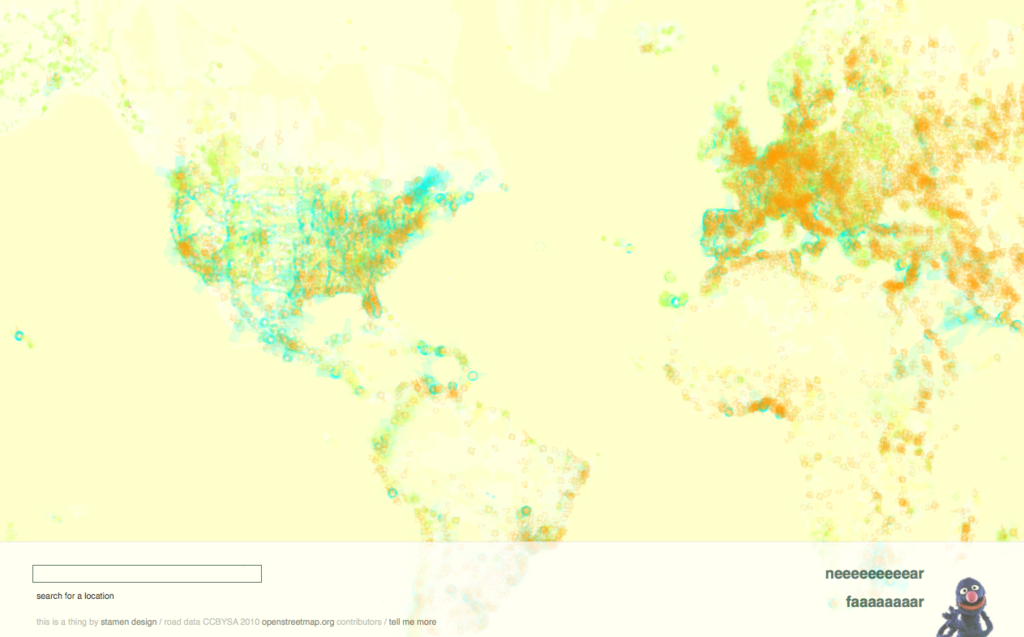
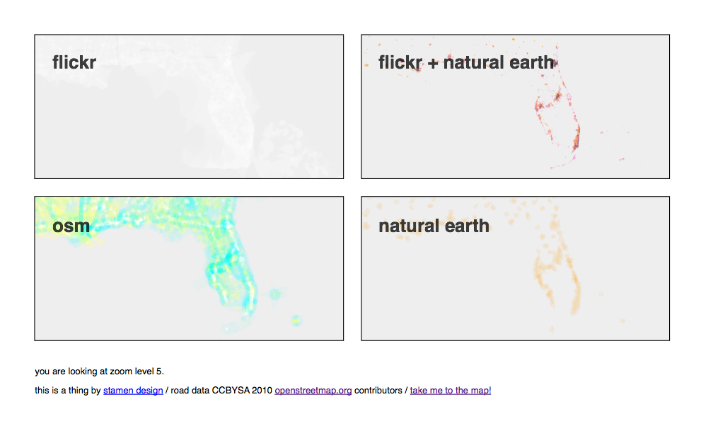
But when you put it all together here's what the world looks like at zoom level 3:
The white ghost-like shapes represent all the places where Flickr users have taken photos; the blue and green lines are OSM motorways and paths respectively; the orange shapes are urban areas
as identified by Natural Earth. Unlike traditional maps most (and sometimes) all the data for a given layer is displayed, with only subtle variations in line width and other design considerations, regardless of zoom level.
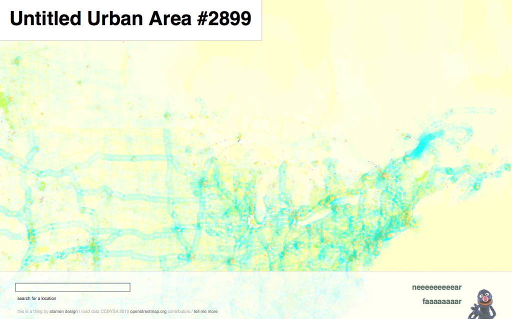
This clustering effect offers a view of built environments around the world but also a visual representation of those places where no data has been recorded. This is most pronounced when you compare the density of coverage for Africa and South America with North America and Europe but you can see the same thing happening when you look at a map of the border between Canada and the United States:
At first glance, there seems to be much happening (aside from what appears to be a bulk import of road data in to OSM for the province of Alberta, in the top left hand corner) much beyond the fiftieth or fifty-first parallel, which pretty accurately reflects where most Canadians live, but if you look closely you can make out the traces of the the outline of all places where people have taken photos and uploaded them to Flickr.
At zoom level 4 the shapes of urban areas begin to respond to mouse events on the screen. As you move you mouse over the outline for an area its name (or in the case of Natural Earth data its unique ID) will be displayed. As you continue to zoom in the pink and blue shapes of cities and neighbourhoods derived from Flickr photos beging to appear and the Natural Earth urban areas shift from the foreground to the background with the OSM roads overlapping in hot flashes around towns and cities and holding everything together in whispers.
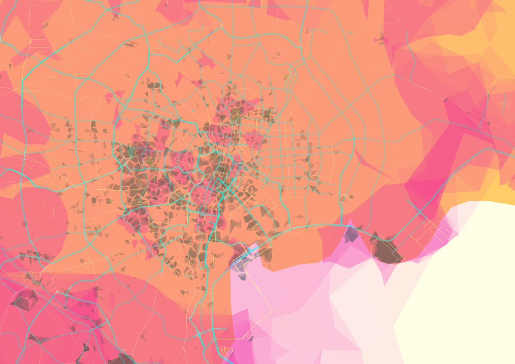
At zoom level 8 city names are shown alongside motorways:
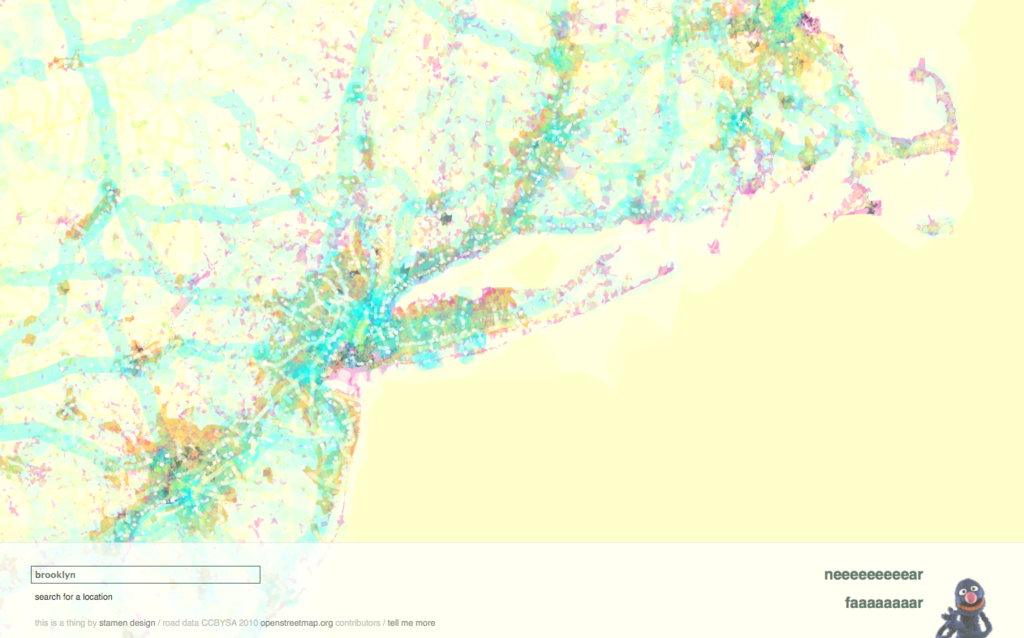
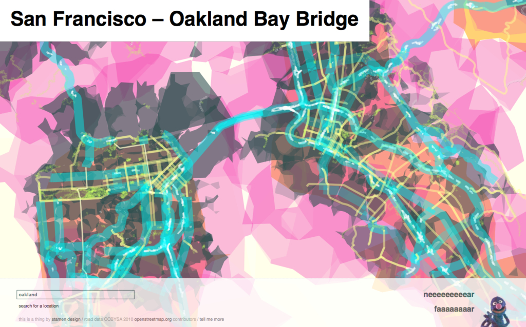
Here's another example just because it's... well, pretty:
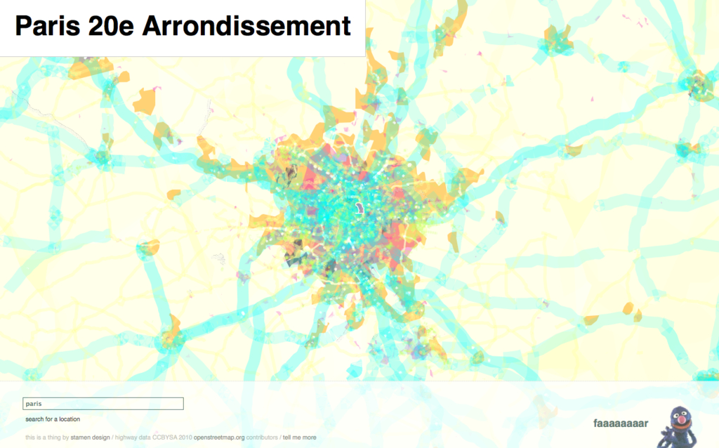
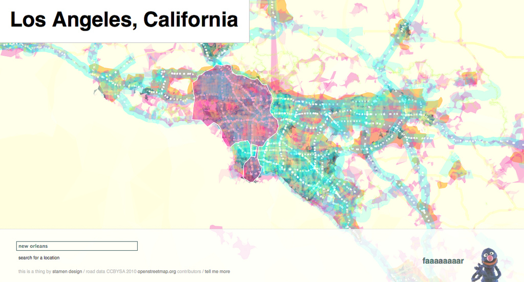
At zoom level 13 neighbourhood names are shown, as are smaller roads and paths and cycleways. On-ramps and off-ramps (or links
as they are known in OSM lingo) are given extra special attention and it's fascinating to see the way they stand out in relation to the rest of the city almost like cartilage in an x-ray:
The entire world has been mapped this way between zoom levels 2 and 10. So far, only the San Francisco Bay Area, Los Angeles, New York and London have been mapped to street level (or zoom level 15). The plan is to add more cities as fast as time and life's usual bad craziness permit. If there's some place you're keen to see mapped let us know.
These maps were made using TileStache and PolyMaps, open-source tools developed by Stamen for generating map tiles and creating interactive slippy-maps. These tools make it possible to design individual map layers quickly and allow you to easily re-arrange the order in which they are displayed and ultimately how they affect one another. The ability to create conventional map tiles that are just raw data and have them be processed and then rendered in the browser opens up avenues only just glimpsed at by a project like prettymaps.
Under normal circumstances, it might be practical to take the four raster layers and render them as a single composited tile set (if only to save on disk space) but we've left them as-is for people who want to look under the hood and see the potential that these tools offer for making new and interesting maps.
prettymaps operates very much at the edge of what the current crop of web browsers are comfortable doing. SVG support in most browsers is still a work in progress and not necessarily designed for displaying the volume of data that prettymaps can sometimes load. That any of this is possible at all is reason enough to celebrate and, we think, to investigate what is possible and where the rough edges remain.
As of this writing, prettymaps works best in the most recent versions of Safari and Firefox, only sort of works in developer versions of Chrome and has not been tested in IE — it will ask a lot from your browser no matter what.
Finally, if you'd like to hide the search box and other map controls you can
toggle their display by pressing the escape button on your keyboard.
This version (August 2010) of prettymaps is coded-named Isola
after
the Finnish textile
designer Maija
Isola. At a time when the tools for making custom maps and bespoke cartographies are becoming easier and more accessible it
is nice to look back at her work and imagine the maps she
might have made if she were alive today.
Isola is also a fictional city in the novels of the writer Ed McBain:
The town, Isola, in which these novels were set, was unmistakably New York. Since it did not declare itself as the Big Apple, it was not open to McBain to rely merely on a recital of the city's famous precincts, parks and landmarks to give his background authenticity. Isola lived, triumphantly in its own right, alongside New York but not simply mimicking it.
Which is a healthy way to think about maps in general.
Okay, great. Now take me to the map!